
On this page
Every Vice Chancellor's office has more dashboards than it did five years ago. Enrollment dashboards. Finance dashboards. Quality assurance dashboards. Faculty workload dashboards. thEach one built by a capable team, each one accurate on its own terms.
And yet ask most Vice-Chancellors a simple question: "What's actually changing across the institution right now, and why?" and the honest answer is often a shrug. Not because no one is tracking anything. Because everyone is tracking something different, in a different system, on a different schedule.
That's the real story behind institutional KPIs for university leaders in 2026. It was never a shortage of metrics. It's a shortage of connection between the metrics that already exist.
Quick answer
More KPIs won't fix a Vice Chancellor's visibility problem. What fixes it is a connected view where enrollment, financial, quality, and faculty signals sit against each other, so a change in one shows up as a signal in the others, not as a separate report that arrives three departments and three weeks later.
Article summary
Problem: Institutions track dozens of KPIs, but leadership still can't see how those signals relate to one another.
For: Vice Chancellors, Presidents, Provosts, and institutional leadership teams.
Shift: From adding more dashboards to connecting the ones that already exist.
Outcome: Leadership sees what's changing, why it's changing, and where to intervene, before it becomes a board-level question.
Key takeaways
More KPIs create more reports, not more clarity, when each one lives in its own system. A single institutional event usually shows up in three or four different dashboards, under three or four different names. The gap isn't measurement. It's the missing layer that connects what's being measured. Connected institutional intelligence means leadership sees relationships between signals, not just the signals themselves.
Why This Matters
Picture a mid-sized university where a specific engineering program's enrollment has quietly dropped for two consecutive intakes. The admissions dashboard shows it as a recruitment number. Around the same time, the finance dashboard shows that program running below its cost-recovery threshold. Separately, the faculty workload dashboard shows two instructors in that same program carrying overload sections because open positions haven't been filled.
Three dashboards. Three departments. Three explanations. Nobody has connected them, because nothing in any of the three systems asks the question: are these the same story?
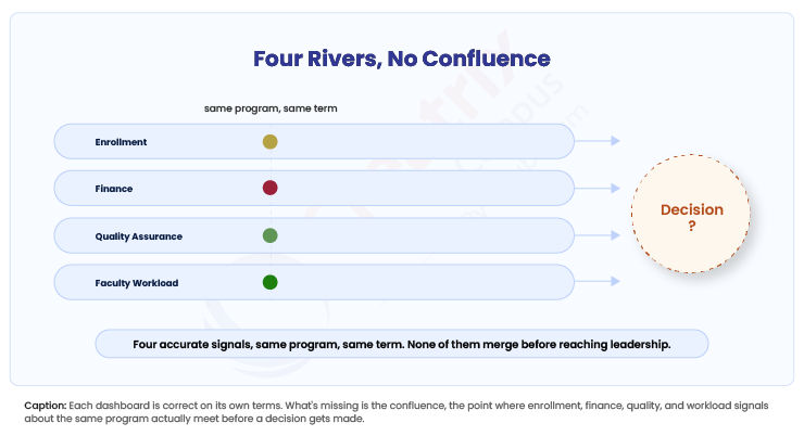
A Vice Chancellor looking at any one dashboard sees a normal fluctuation. A Vice Chancellor looking at all three, side by side, sees a program in early distress, months before it would show up as a budget problem or an accreditation finding.
This is the pattern behind most institutional surprises. Not a missing metric. A missing line between metrics that were tracked correctly, in isolation, by people doing their jobs well. EDUCAUSE's Top 10 IT Issues list for 2026 names building a data-centric culture as one of higher education's defining priorities, and the emphasis there isn't on collecting more data. It's on making the data that already exists usable across the institution, not just within the office that generated it.
Few institutions realize how much leadership time gets spent reconciling dashboards that should already agree with each other. That reconciliation work, someone quietly cross-referencing three reports before a board meeting, is itself a symptom. It shouldn't be a job. It should be a view.
The KPI You're Missing Isn't a New One
Most institutions don't need a seventh KPI category. They need the six or eight they already have to talk to each other. Enrollment data means something different when it sits next to retention data for the same cohort. Faculty workload data means something different when it sits next to program-level financial performance. Quality assurance findings mean something different when they sit next to the curriculum changes that triggered them.
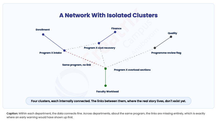
At first glance, this looks like a reporting problem, something a better weekly summary could fix. But here's what changes everything: the connection has to exist in the data layer, not in someone's memory of what the other dashboard said last month. A weekly summary compiled by a analyst is a snapshot assembled after the fact. A connected view is current the moment any one signal changes, because the systems that hold enrollment, finance, quality, and faculty data are talking to each other continuously, not being stitched together by a person with three browser tabs open.
Think about what this means for a Provost preparing for an accreditation visit, or a Registrar explaining a progression anomaly, or a Dean defending a program's viability. Each of them currently builds their own case from their own system, and each case can quietly contradict the others without anyone noticing until a reviewer or a board member asks the one question that exposes the gap.
| Approach | What leadership sees | What it misses |
| More KPI dashboards | More individual metrics, each accurate | The relationship between metrics tracking the same underlying event |
| Manual cross-reference | A point-in-time reconciliation, usually before a meeting | Continuity; the connection breaks again the moment the meeting ends |
| Connected institutional view | Academic, financial, quality, and workload signals read against each other continuously | Nothing new to build; it uses the data institutions already have |
From Dashboards to a Connected View
The shift Vice Chancellors actually need isn't a bigger dashboard. It's a different question asked of the same data: not "what is this number this week," but "what else changed when this number changed." That question only gets answered when enrollment, financial, quality, and faculty systems share a common institutional model, one where a curriculum change, a staffing gap, or an enrollment shift is visible as a single event with multiple consequences, rather than four unrelated line items.
This is where an Academic Operating System functions differently from a stack of point dashboards. It doesn't add another metric to monitor. It connects academic, student, quality, and operational signals so that a change surfacing in one area of the institution is visible, in context, everywhere it matters. That's the practical meaning of a connected institutional intelligence layer: leadership sees the program in distress before it becomes a budget crisis, and sees the accreditation gap before it becomes a finding.
None of this requires abandoning the KPIs already in place. It requires putting them in the same room.
Conclusion
If your institution's dashboards each tell a clean story on their own but rarely agree with each other in the room where decisions get made, that's worth raising with your leadership team before the next planning cycle, not after it. See how a connected institutional view works for your leadership team.
Quick recap
Vice Chancellors don't lack KPIs. They lack a connected view across the KPIs they already track. A single institutional event, a program's enrollment softening, a workload imbalance, a quality gap, usually shows up in multiple dashboards under different names, and nobody is asked to connect them until it's already a problem. The fix isn't a new metric. It's a shared institutional model where academic, financial, quality, and workload signals read against each other continuously, so leadership sees what's changing and why, early enough to act.
Frequently asked questions
What are the most important KPIs for a Vice Chancellor to monitor?
Why do university leaders still lack visibility even with multiple dashboards in place?
How is institutional intelligence different from a KPI dashboard?
Does this require replacing existing systems?
Join the conversation
Want to contribute?
We welcome thought leaders to share ideas and write for our blog.
Become a guest author