
On this page
A university can have a dashboard for admissions, another for attendance, another for faculty workload, and a fourth for programme outcomes, and still have no single view of what's actually happening to a specific cohort of students this term. Each dashboard can be technically correct and leadership can still be missing the picture.
Quick answer
Data analytics improves student and faculty success in higher education when data from different academic operations, student progression, assessment, faculty workload, course demand, can be interpreted together rather than reviewed as separate reports. The value isn't in having more dashboards. It's in whether the data behind them can be connected into a single, coherent view that leads to a decision.
Article summary
This article moves past the usual list of things analytics can do, track admissions, monitor attendance, flag academic performance, and asks a more useful institutional question: why do universities that already collect enormous amounts of data still make decisions with only part of the picture. The answer is fragmentation, not a lack of dashboards, and the article looks at what it actually takes to turn disconnected reporting into institutional intelligence that leaders can act on.
Key takeaways
- Universities generally have enough data. What they lack is a connected view across student, faculty, and institutional systems.
- A dashboard can be completely accurate and still give leadership an incomplete picture if it only reflects one system.
- Student success and faculty capacity are connected data problems, not separate ones.
- Predictive language should be used carefully. Analytics is better described as surfacing patterns and signals than as guaranteeing an outcome.
- Institutional intelligence means connected data leading to a decision and an action, not simply a better looking report.
A Dashboard Can Be Accurate and Still Give Leadership the Wrong Picture
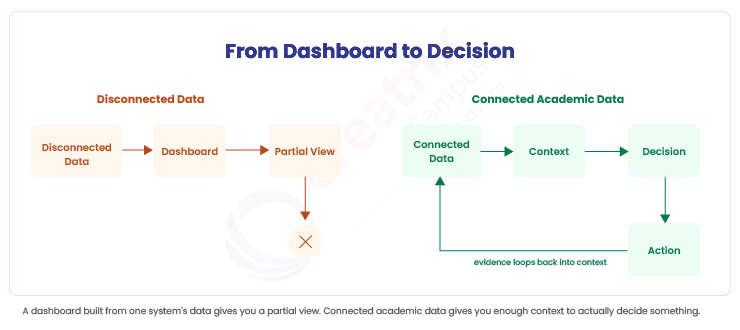
Here's the real problem with how most institutions use data. An admissions dashboard is accurate. An attendance dashboard is accurate. A faculty workload spreadsheet is accurate. Each one reflects its own system correctly. None of them were built with each other in mind, which means a leader looking at any single one is only ever seeing a fragment, even when that fragment is perfectly correct.
This is why data → dashboard is a weaker model than most institutions realize. A dashboard shows you what one system recorded. It doesn't tell you why a metric moved, whether it connects to something happening elsewhere in the institution, or what to actually do about it. That requires context, and context requires more than one system's data at a time.
EDUCAUSE's 2026 showcase on data and analytics in higher education frames this directly: institutions bringing data into strategic use need strong data governance and data literacy as the foundation, not simply more reporting tools layered on top of existing systems. Governance and literacy are what make it possible to trust and interpret data across systems, not just within one.
Student Success and Faculty Capacity Are Not Separate Data Problems
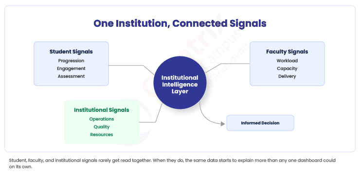
Now think about how these fragments actually connect in practice. A student intelligence view looks at progression, engagement, assessment results, and course access. A faculty intelligence view looks at teaching capacity, workload, and assessment responsibilities. An institutional intelligence view looks at what becomes visible when student, faculty, academic, and operational data can be read together, not as three separate dashboards owned by three separate offices.
Here's why that separation causes real problems. A student struggling to get into a required course isn't only a student success issue. It might also be a faculty capacity issue, if there simply aren't enough sections staffed to meet demand. Treating these as two unrelated dashboards means the institution can spend effort improving advising outreach while the actual bottleneck, capacity, goes untouched.
| Institutional Question | Data Often Viewed Separately | What a Connected View Can Reveal |
| Are students progressing as expected? | Enrollment, assessment, course progression | Where progression friction may be occurring |
| Do we have enough teaching capacity? | Faculty workload, course demand, scheduling | Where delivery pressure is building |
| Why is a programme underperforming? | Outcomes, assessment, programme review | Whether the issue is isolated or recurring |
| Are improvement actions working? | Quality actions, subsequent evidence | Whether a change produced measurable movement |
| Where are resources under pressure? | Demand, capacity, academic operations | Where planning decisions may need attention |
Notice that none of these questions can be answered from a single dashboard, no matter how well designed that dashboard is. Each one requires reading two or three data sources against each other, which is exactly the step most institutions currently do by hand, in a spreadsheet, right before a board meeting.
Where Creatrix Campus Fits
Creatrix Campus connects academic operations, curriculum, assessment, student records, and faculty workload, within one governed system, so institutional effectiveness and student success leaders can review a question across systems rather than reconciling separate exports from each one. Because the underlying data shares a common structure, a pattern that touches both student progression and faculty capacity can be seen as one connected picture rather than two unrelated reports.
Where Creatrix Campus surfaces early signals for student success and retention, those signals are meant to support earlier investigation by advisors and academic leaders, not to predict or decide an outcome on their own. Interpreting what a pattern means and deciding what action to take remains with faculty and institutional leadership.
Institutional effectiveness data connects most directly through academic governance, while student progression and early signals sit within student success and retention, so the two can be read against each other rather than reported separately.
Conclusion
The question is no longer whether universities have enough data. It's whether leaders can see enough of the institution at once to actually make sense of it. A dashboard for every office was never going to solve that on its own, and adding another one won't either. The more useful step for your next leadership meeting is asking which two dashboards in your institution should already be talking to each other, and currently aren't. If you want to see how student, faculty, and institutional data can be read together instead of separately, request a demo of Creatrix Campus.
Quick recap
Universities generally have enough data already. What's missing is a connected view across student, faculty, and institutional systems, since a dashboard built from one system can be accurate and still leave leadership with an incomplete picture. Institutional intelligence means connected data leading to an actual decision, not simply another report.
Frequently asked questions
How can data analytics improve student and faculty success in higher education?
Why isn't having more dashboards the answer?
Can analytics predict which students will drop out?
Are student success and faculty capacity really connected data problems?
Join the conversation
Want to contribute?
We welcome thought leaders to share ideas and write for our blog.
Become a guest author